Branding · Web design
Aknaportaal
brand & web
Aknaportaal (Estonian for “window portal”) came to us with a clear vision of the brand they wanted. Our job was to turn that vision into a polished, consistent identity and a website to match.
- Client
- Aknaportaal
- Year
- 2020
- Services
- Branding
- Logo design
- Web design
- 3logo versions
- 4brand colours
- 1website
The story
From brief to result
Listening first
Not every project needs reinvention. The client knew what they wanted, so we focused on precise execution: refining their idea into a mark that works at every size, from favicon to signage.
A window to trust
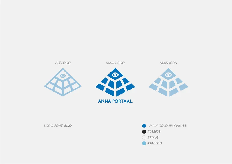
The logo stacks window panes into a pyramid crowned with an eye — a portal you can see through. The name is set in bold uppercase BIKO, and the blue palette was chosen to communicate trust, comfort, reliability and strength.
System and site
We delivered main and alternative logos, an icon, profile pictures and app-style avatars, a defined colour palette, and a website built on the same visual language.
Interactive · Click to copy
A palette built on trust
One confident blue does the heavy lifting, supported by a graphite, a soft light grey and a sky tint for secondary elements. Click any swatch to copy its HEX value.
Want results like these?
Tell us about your brand, product or campaign — we'll come back with a plan, not a sales pitch.