Rebrand · Packaging · Web
Metsaserva Mesi
rebrand
Metsaserva Mesi is a family-owned honey producer whose brand identity had fallen behind the quality of its product. We were asked to modernise the brand without losing the warmth and authenticity of a family business.
- Client
- Metsaserva Mesi
- Year
- 2023
- Services
- Branding
- Graphic design
- Product photography
- Web design
- 3product lines
- 10brand colours
- 4touchpoints: pack, web, photo, print
The story
From brief to result
The challenge
An outdated look made a premium local product blend in on the shelf. The new identity had to work for organic honey, classic honey and beekeeping supplies — on jars, online and in print.
Rooted in the hive
We redrew the logo around a delicate bee illustration and a confident wordmark, then built a honeycomb pattern and a warm palette of honey yellows, ambers and deep browns that ties every product line together.
A family of products
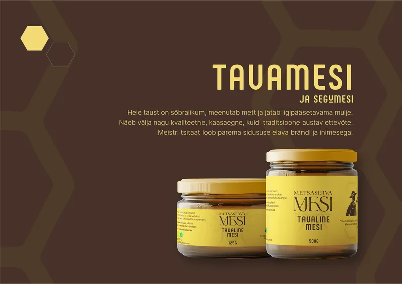
Each line got its own personality: bright yellow for Mahemesi (organic honey), rich brown for Tavamesi (classic honey) and a calm neutral system for beekeeping supplies. We completed the rebrand with product photography and a new website.
Interactive · Click to copy
Brand colours, straight from the hive
Ten hexagons — meadow greens, honey yellows and ambers, and the deep brown of dark forest honey. Click a cell to copy its HEX value.
Want results like these?
Tell us about your brand, product or campaign — we'll come back with a plan, not a sales pitch.