Packaging · Product development
Sauflex Aroma+
sauna scents
Sauflex asked us to design a high-end essential-oil range for sauna lovers — a product that feels premium on the shelf, fits the wider Sauflex brand and speaks to an audience that treats the sauna as a ritual.
- Client
- Sauflex
- Year
- 2023
- Services
- Branding
- Graphic design
- Product development
- Product photography
- 11scents in the system
- 10 mldropper format
- 1scalable label grid
The story
From brief to result
The challenge
Essential oils are a crowded category full of look-alike labels. The range needed to look premium, communicate each scent at a glance and still carry all the mandatory safety and regulatory information on a 10 ml bottle.
A periodic table of scents
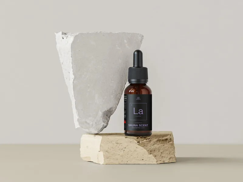
We built the identity around the periodic table: every scent gets its own number, two-letter symbol and signature colour — Eu for eucalyptus, Le for lemon, Te for tea tree. The system is instantly collectable and easy to extend as new scents are added.
From label to lifestyle
Dark, matte labels sit on amber glass for a clean apothecary feel, with hazard pictograms, QR code and barcode integrated into the grid. We finished the project with product photography for e-commerce and social media.
Interactive · Pick an element
The periodic table of sauna scents
Eleven scents, each with its own number, symbol and colour. Choose an element to see its bottle.
06 · Lavender
Want results like these?
Tell us about your brand, product or campaign — we'll come back with a plan, not a sales pitch.